
Back to all work
DATA VISUALIZATION • PRODUCT DESIGN • UX/UI DESIGN • DESIGN SYSTEMS
Data Visualizations & Dashboards
Spearheading a bureau-wide effort to design and develop data visualization and dashboarding standards, creating a unified user experience across data products used by stakeholders at all levels of the organization and worldwide.
ROLE
Product Designer, UX/UI Designer
Inconsistent and poorly designed data products were causing confusion and a loss of trust.
The Bureau's data products had grown organically across teams and systems, each built independently with no shared design language. Stakeholders, from senior leadership to implementation teams, were navigating dashboards that looked and behaved differently depending on which team had built them. There was no consistency in chart types, interaction patterns, filtering conventions, or visual hierarchy.
The result was a trust problem. When the same data looked different in two dashboards, people questioned which one was right. When navigation patterns changed from one tool to the next, users wasted time relearning interfaces instead of extracting insights. The Bureau needed a unified approach to how data was presented, explored, and acted upon.
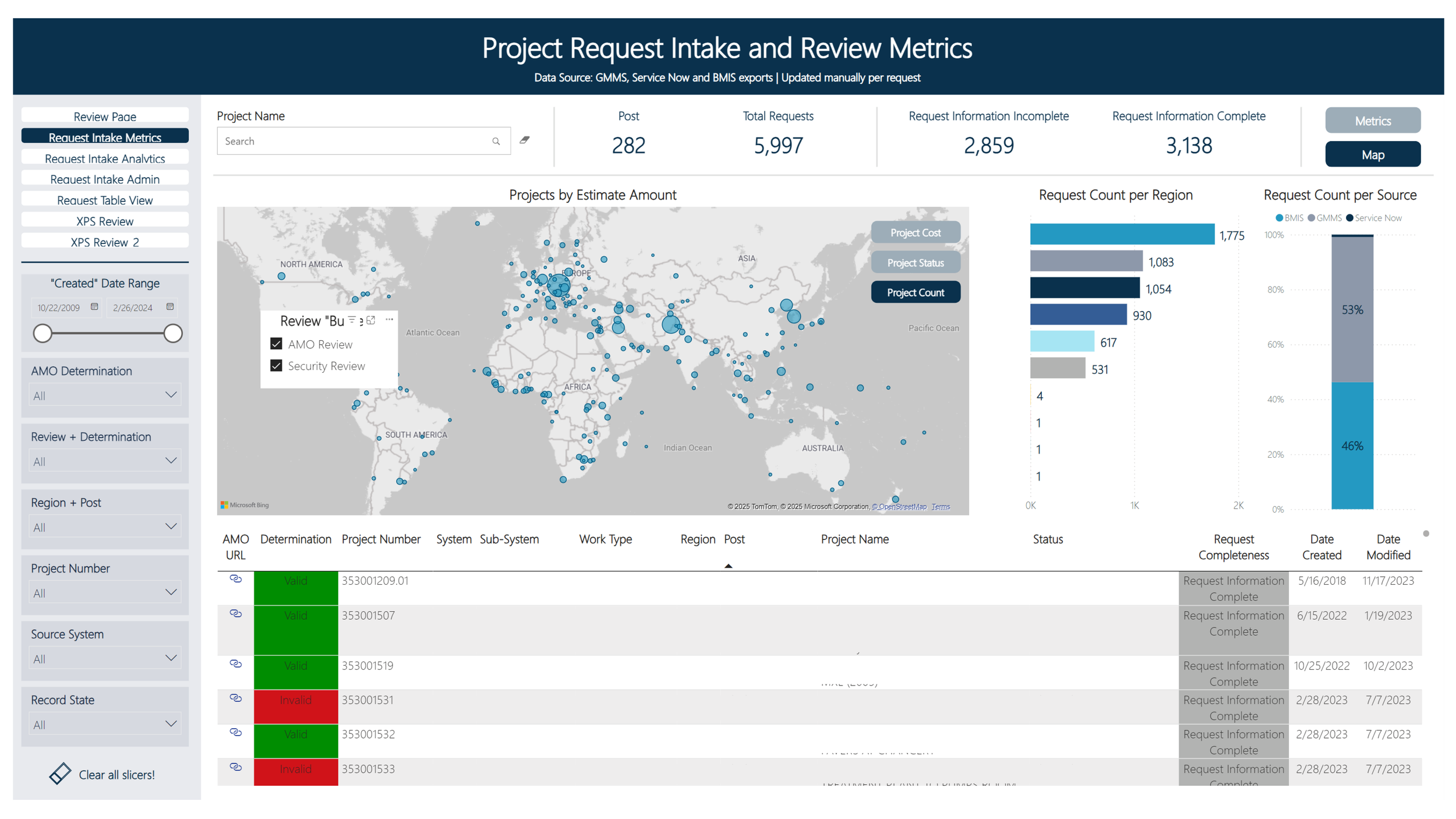
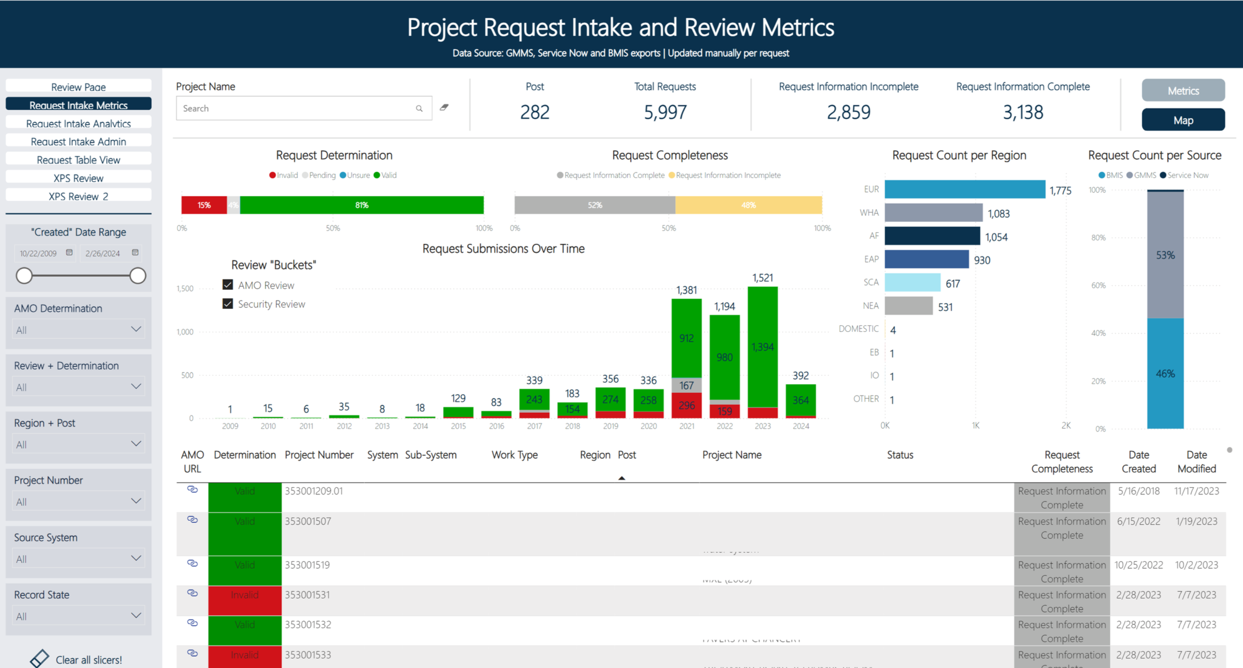
Interactive dashboard used to facilitate a global portfolio review of projects.
CHALLENGE
Designing for Drill-Down
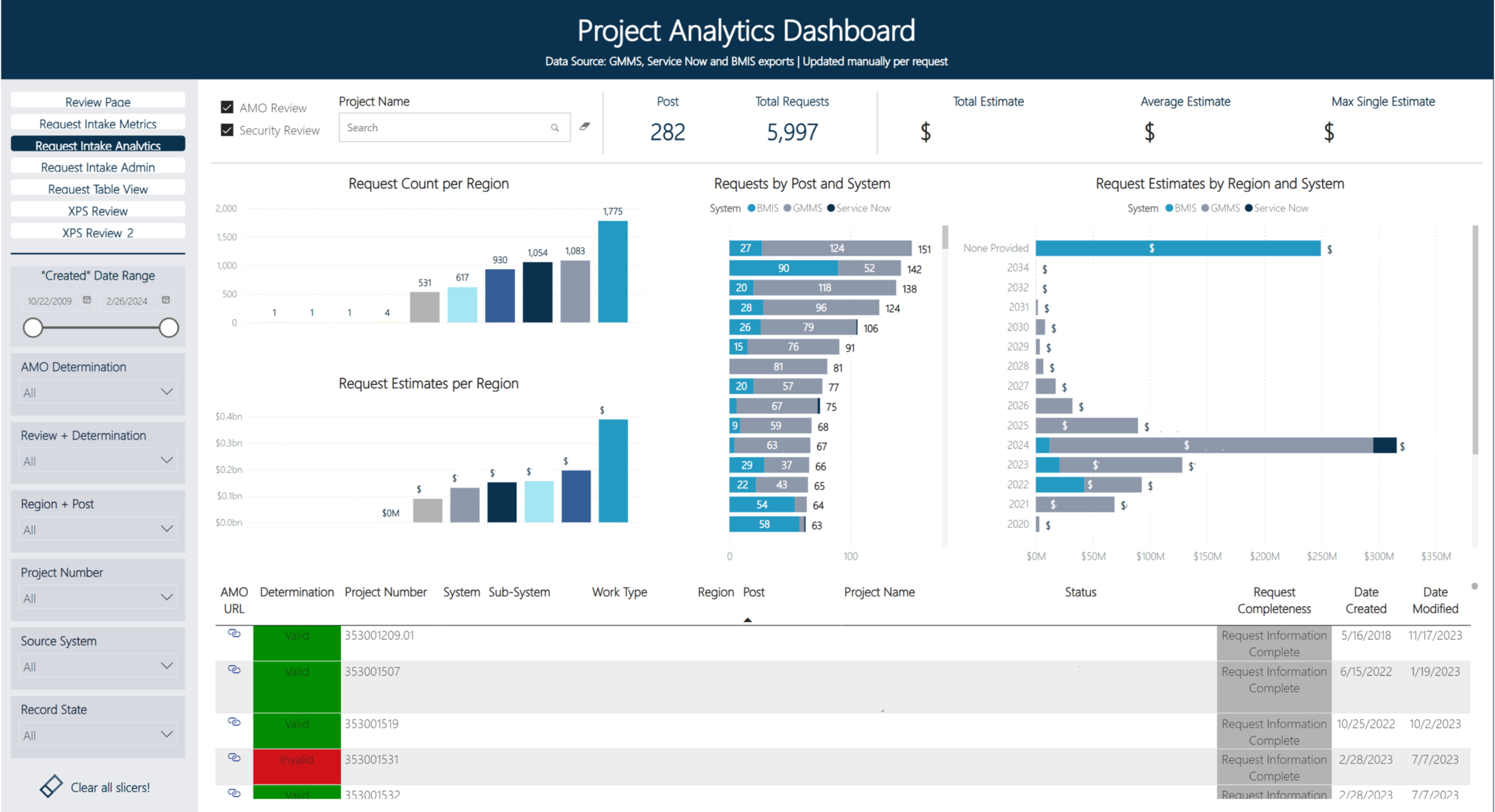
The dashboards I designed follow a consistent three-layer architecture. The first page presents high-level summary metrics — KPIs and aggregate charts that answer the question "how are we doing?" at a glance. From there, users can progressively drill down into the data, filtering by region, system, project type, or time range to answer their specific questions.
Each dashboard is composed of three structural components: a Title Bar identifying the data source and context, a Navigation/Operation Bar providing filters and drill-down controls, and a Body containing the metrics and charts. This framework gives every dashboard a predictable structure while allowing flexibility in the specific data being displayed.
Project Request Intake and Review Metrics dashboard — summary view with KPI cards, bar charts by estimate amount, and request count by region
I worked closely with both business and technical teams to understand what questions each stakeholder group was trying to answer. Senior leaders needed at-a-glance status across portfolios. Program managers needed to slice data by region and project type. Analysts needed the ability to get down to individual records. The three-layer architecture serves all of these needs through progressive disclosure rather than overwhelming users with everything at once.
INTERACTIVE DATA DASHBOARDS
Visualizing Strategic Direction
The Improvements Strategic Roadmap is a dynamic tool I designed to give the Bureau a comprehensive, interactive view of all active improvement efforts. It needed to serve two very different audiences: senior leadership wanting a clear picture of strategic direction across workstreams and milestones, and implementation teams needing to drill into individual efforts to understand business cases, teams involved, and systems affected.
I led this effort end to end — working with and between business and technical teams to gather requirements, organize and collect the data, and design iterative solutions. The data was sourced from Palantir, and the challenge was translating complex, interconnected initiative data into a visual format that made the relationships between workstreams, timelines, and organizational impact immediately clear.
The roadmap supports multiple navigation paths. Users can filter by milestone category, drill into specific workstreams, or explore by system and functional area. Each improvement effort reveals its full context on selection — the business case, the team involved, and the systems affected — fostering a deeper understanding of the Bureau's strategic journey without requiring users to leave the tool or cross-reference other documents.
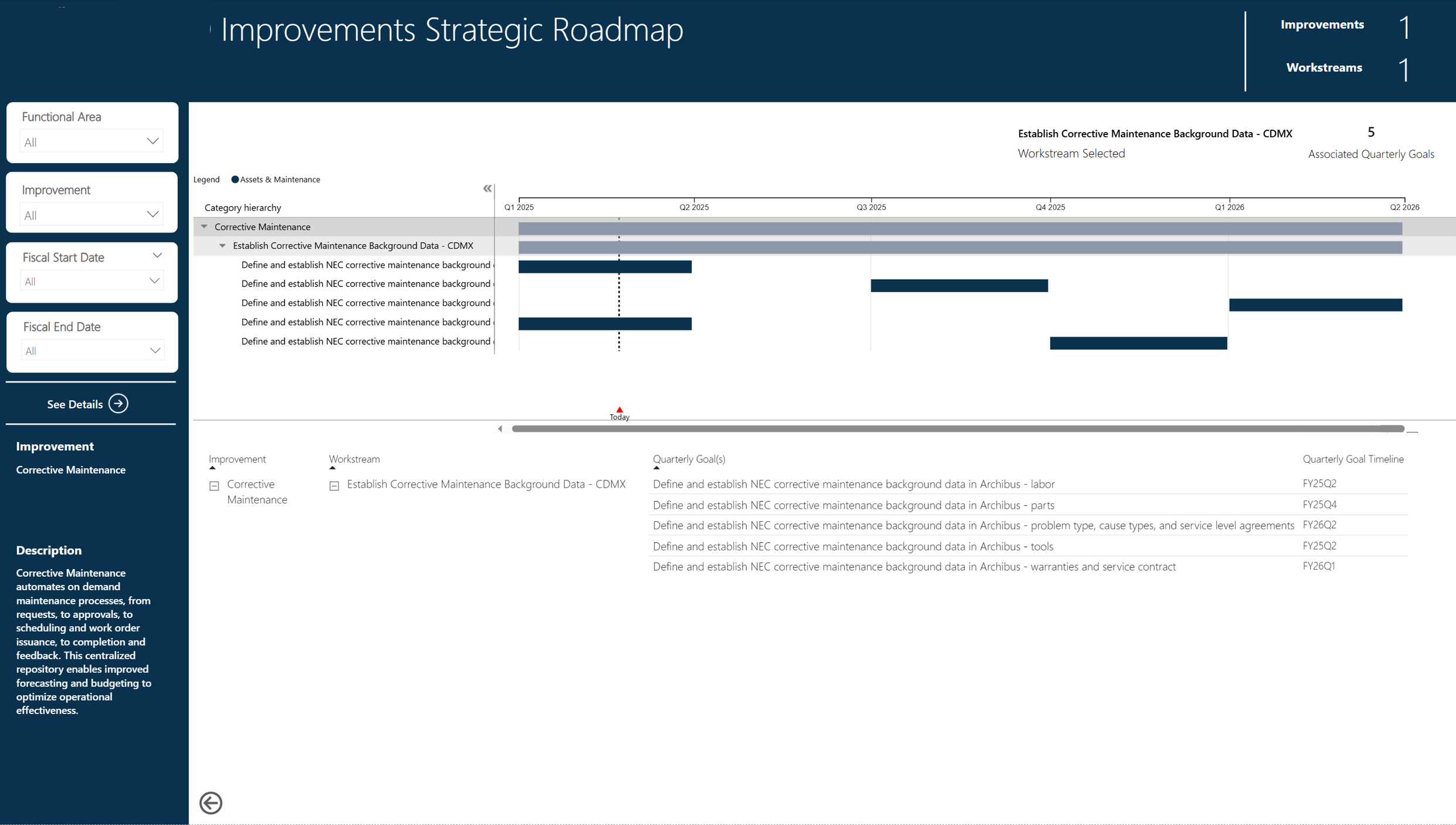
Improvements Strategic Roadmap — Palantir-sourced data showing milestones, workstreams, and initiative detail with interactive filtering
INTERACTIVE STRATEGIC ROADMAP
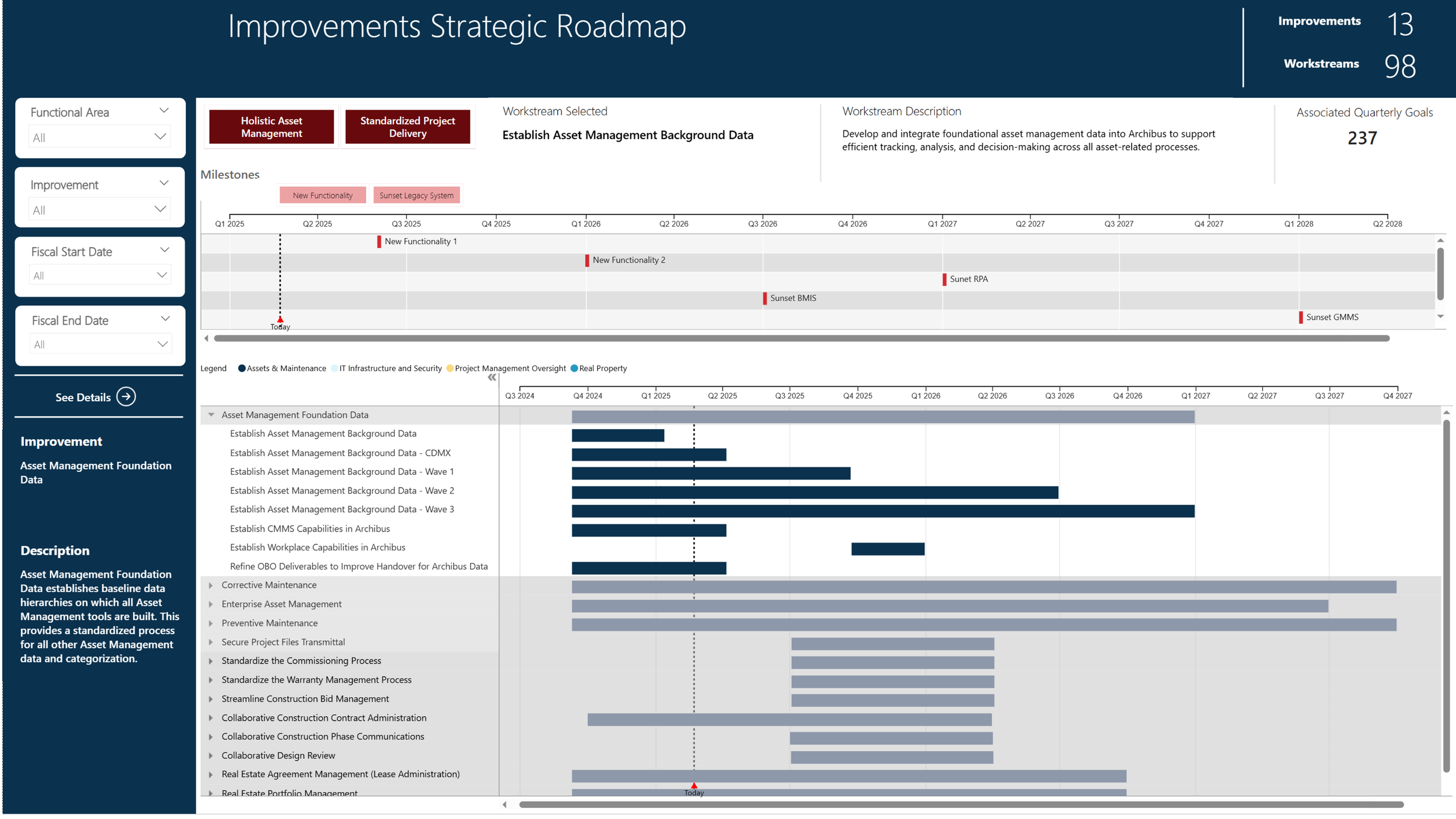
Improvements Strategic Roadmap — Palantir-sourced data showing milestones, workstreams, and initiative detail with interactive filtering
Communicating Complex Processes
As the primary visualizations designer in the Strategic Portfolio Management office, I worked across business, strategy, process, technical, and communications teams to design data visualizations for use in products, presentations, and communications materials. This work ranged from process flow diagrams that mapped intake-to-execution pipelines, to visual frameworks that made complex scheduling and approval workflows comprehensible to non-technical stakeholders.
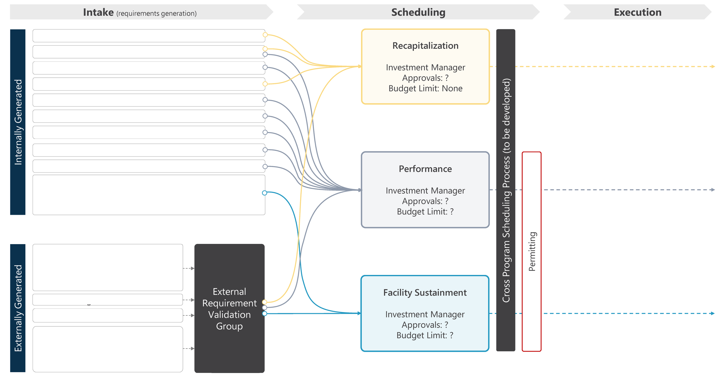
Intake-to-Execution process flow — mapping manually and externally generated requirements through scheduling, approvals, and program executioN
DATA VISUALIZATIONS
Codifying the Standards
To ensure that the design patterns and conventions I'd established would outlast any individual project, I designed and embedded a bureau-wide Dashboard Style Guide. The guide covers three key areas: information architecture (how dashboards are structured and how users navigate them), visual style (color, typography, spacing, and hierarchy), and charts and table styling (which chart types to use for which data patterns, and how to format data tables for scannability).
The style guide serves as the source of truth for any team building a data product within the Bureau. It ensures that whether a dashboard is built by the core data team or a regional office, users encounter the same interaction patterns, the same visual conventions, and the same level of quality — building the trust in data products that the organization needed.
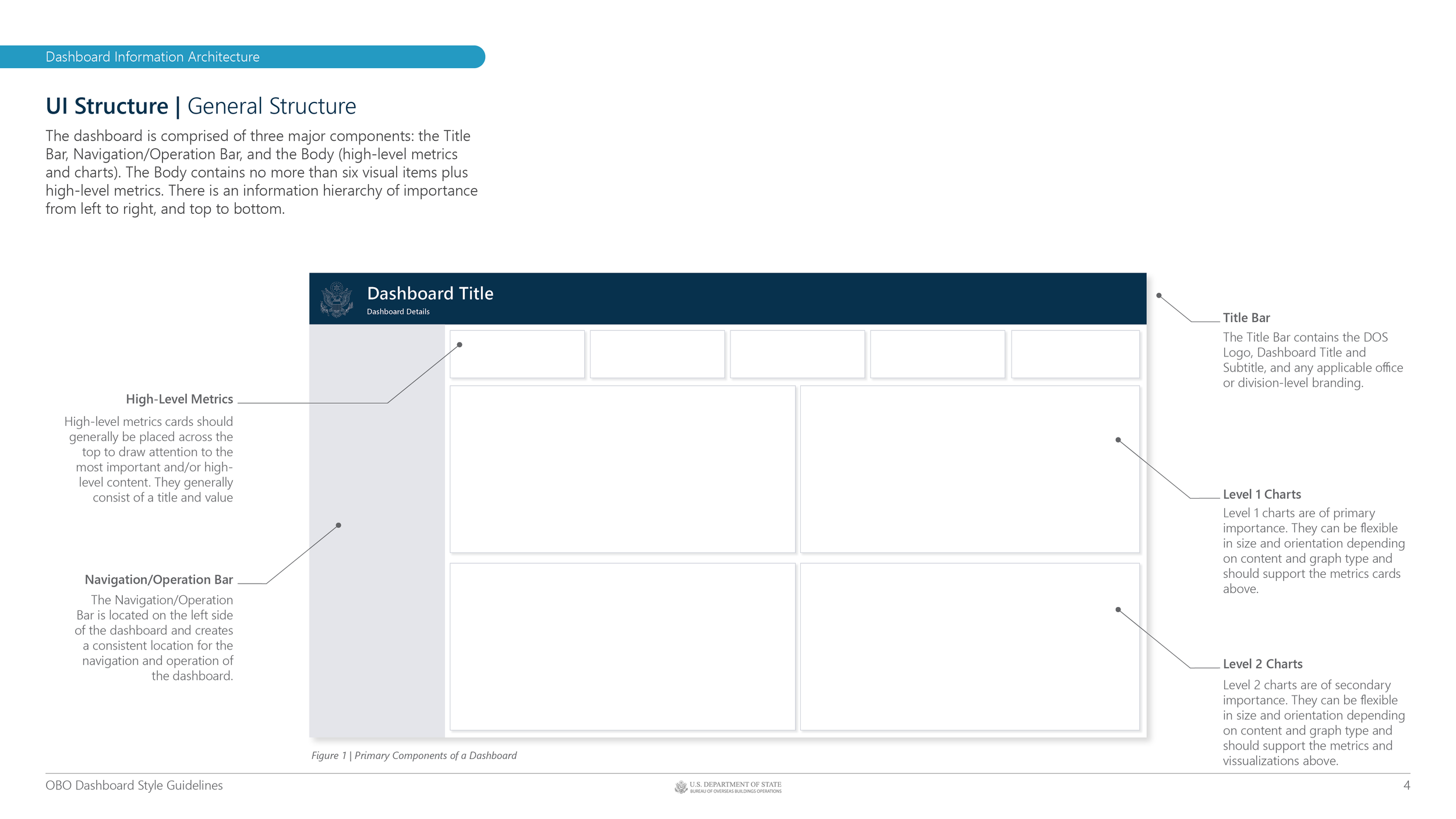
Dashboard Style Guide v1.1 - Information Architecture
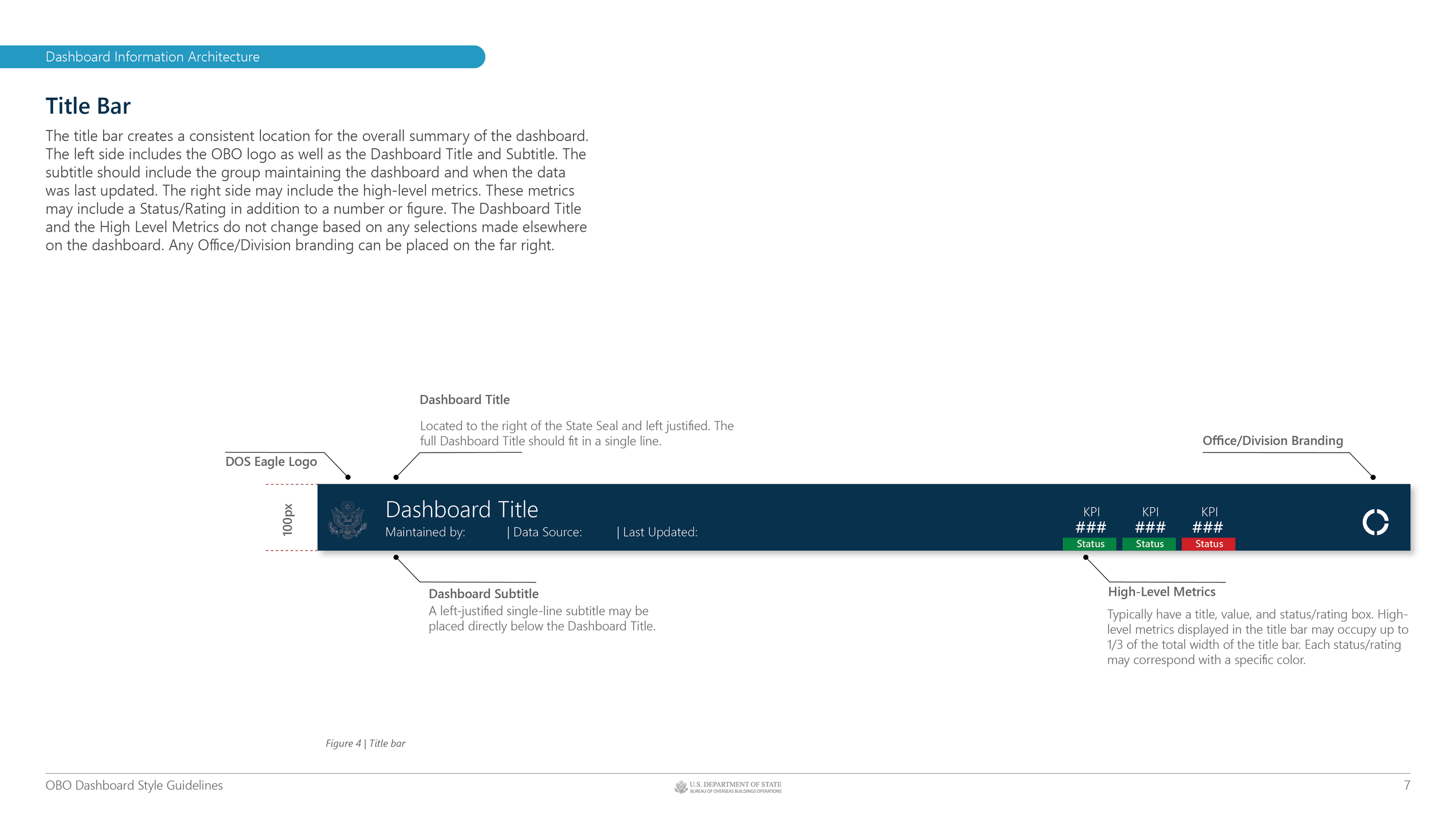
Dashboard Style Guide v1.1 - Title Bar Details
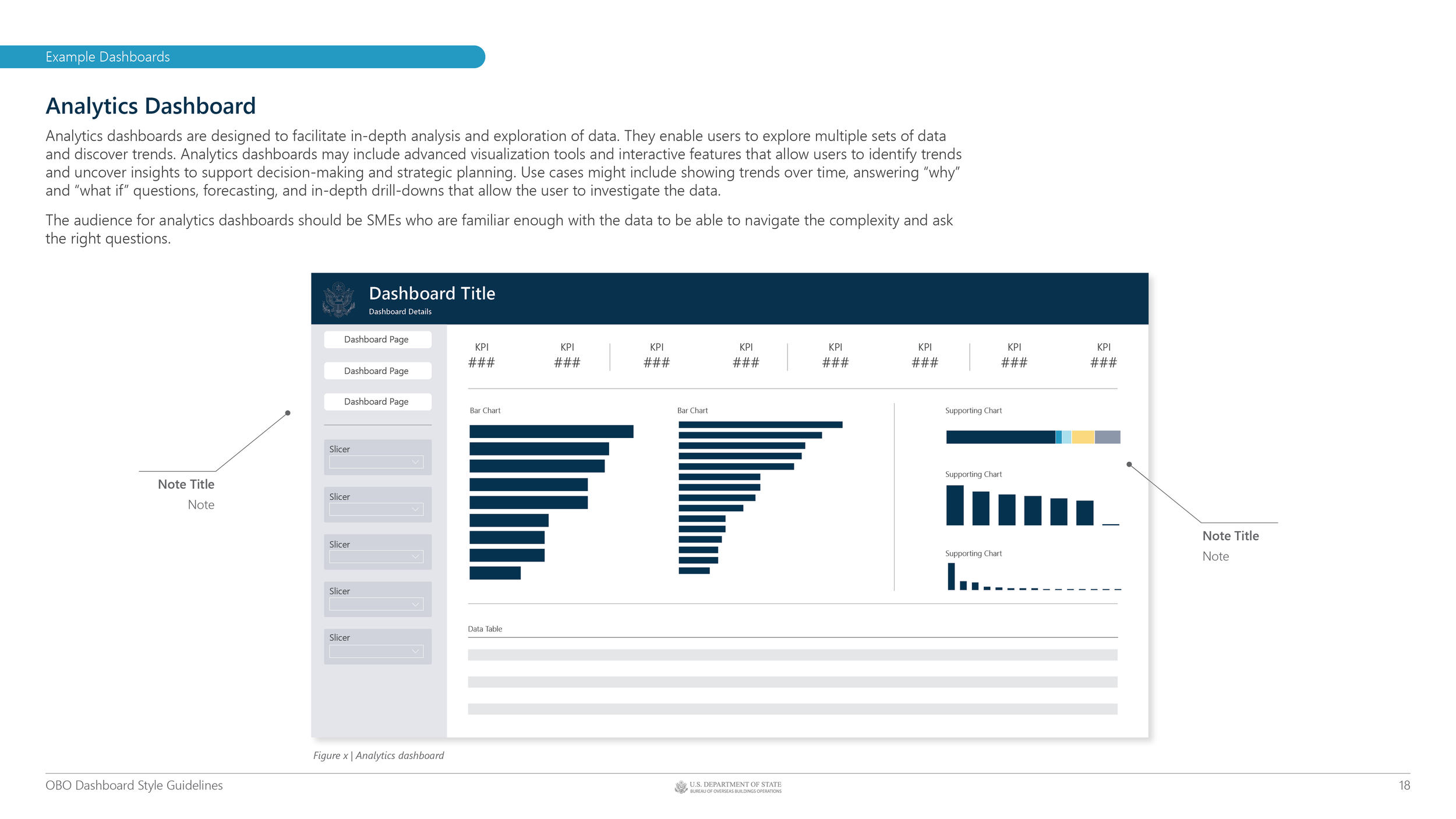
Dashboard Style Guide v1.1 - Analytics Dashboard Example
DASHBOARD STYLE GUIDE
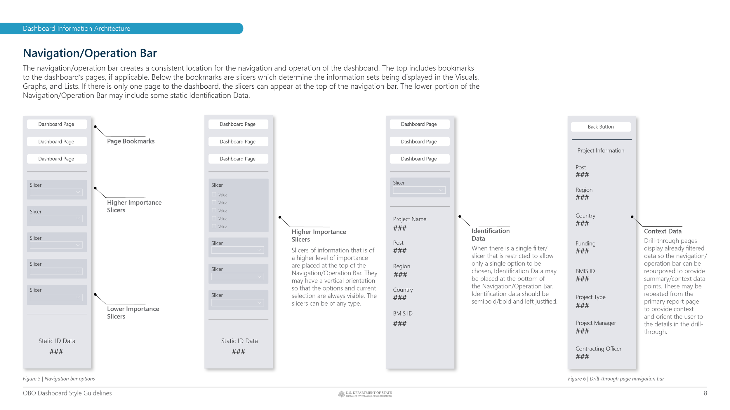
Dashboard Style Guide v1.1 - Navigation Bar Examples
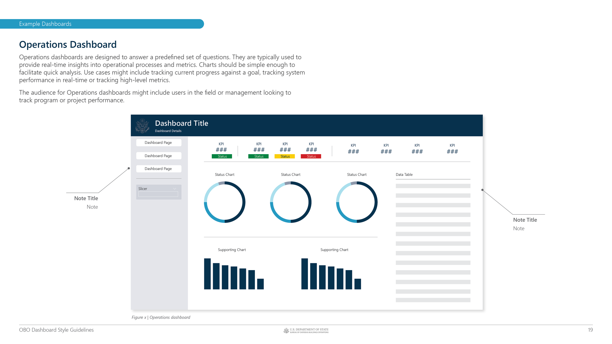
Dashboard Style Guide v1.1 - Operations Dashboard Example

Back to all work