
Back to all work
AI PRODUCT DESIGN • MOBILE APP CONCEPT • BEHAVIORAL DESIGN
Tiny Life Experiments
Designing an AI-powered app that treats users as curious scientists running low-stakes tests on their own lives. Tiny Life pairs a structured AI coaching system with a calm, minimal interface, guiding users through the design, execution, and reflection of 7-day behavioral experiments. The goal is never completion, but learning and growth.
*This is a fully-functional working prototype that I developed using Claude Code and Google AI Studio.
ROLE
Product Designer & AI Architect
TYPE
Concept | Side Project
Most behavior-change apps optimize for streaks, motivation, and accountability. They treat users as performers who need to be pushed. They reward consistency, not insight. They treat a missed day as failure, not data. They scale up too fast, triggering the anxiety that shuts down behavior before it can form. And because they measure output rather than learning, users disengage when the streak breaks.
CHALLENGE
Behavior change apps optimize for the wrong thing.
The core challenge was designing an AI system prompt sophisticated enough to generate genuinely useful behavioral experiments — not generic wellness advice — while keeping the interface calm enough that users wouldn't feel observed or evaluated.
Every design decision traced back to a behavioral science principle. The AI system prompt operationalizes those principles as adaptive logic rules — conditionals that shape what kind of experiment gets designed based on the user's emotional state, constraints, and risk tolerance.
DESIGN APPROACH
Precision over prescription.
1
Emotional Friction
High overwhelm → scope is halved. Self-doubt → confidence tracking added.
2
Time Constraints
Under 10 minutes available → micro-action only, no exceptions.
3
Risk Tolerance
Low → observational design. High → mild discomfort introduced deliberately.
4
Constraint Type
Fear-based constraints → exposure ladder. Low energy → reduction experiment.
-
![]()
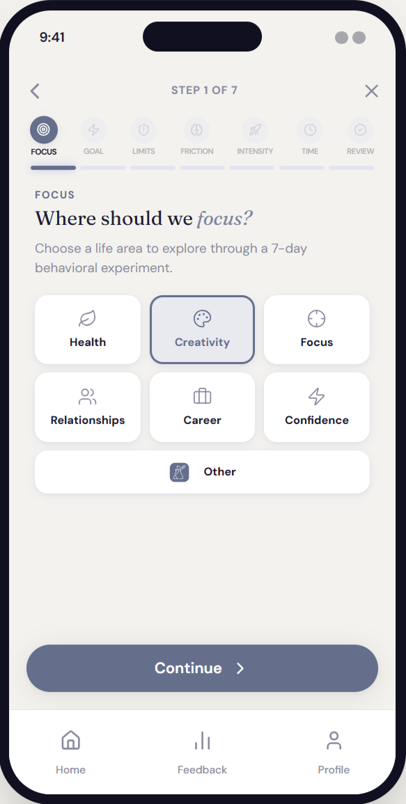
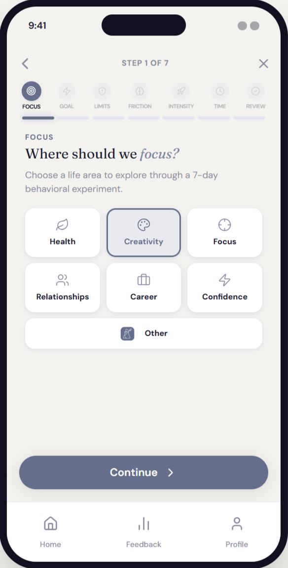
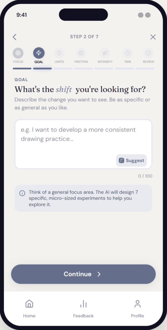
Onboarding | Focus
-
![]()
Onboarding | Goal
-
![]()
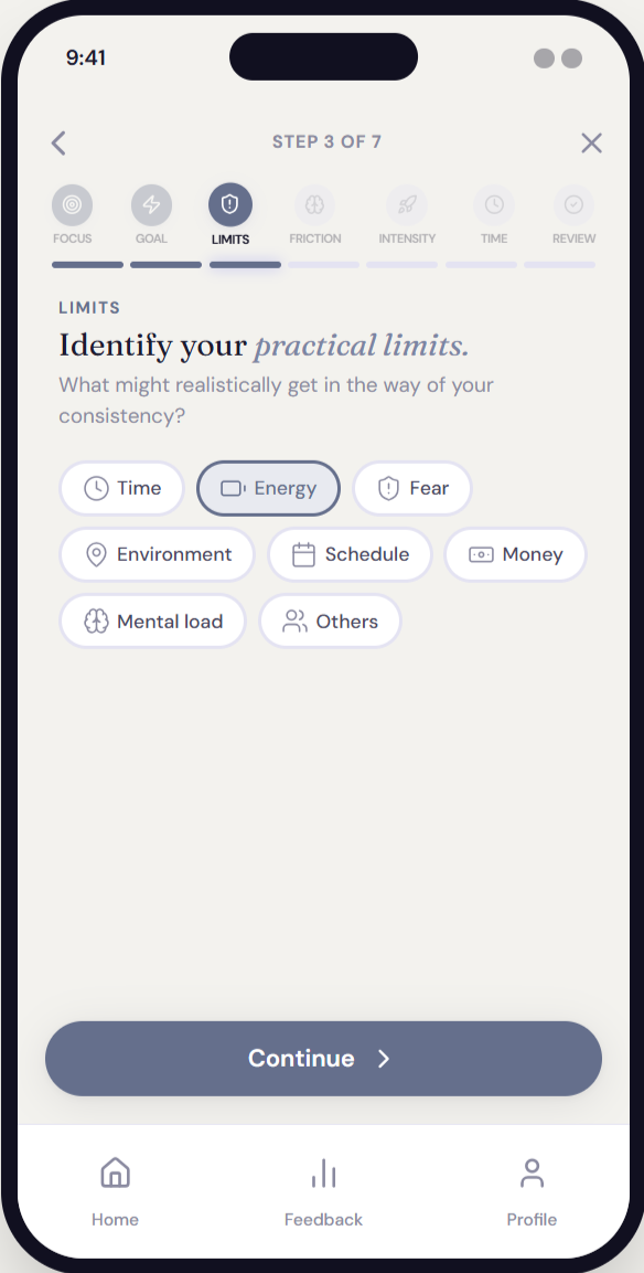
Onboarding | Limits
-
![]()
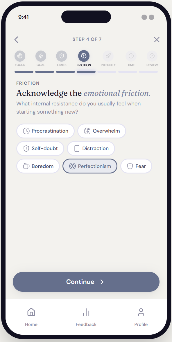
Onboarding | Friction
-
![]()
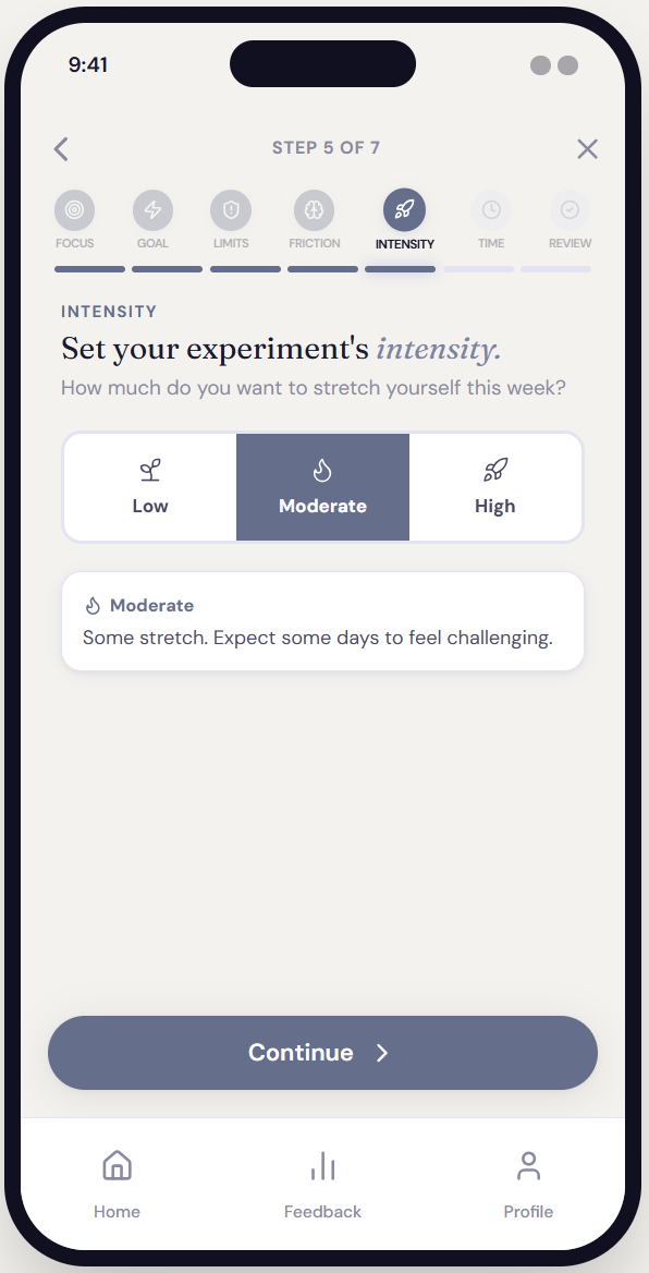
Onboarding | Intensity
-
![]()
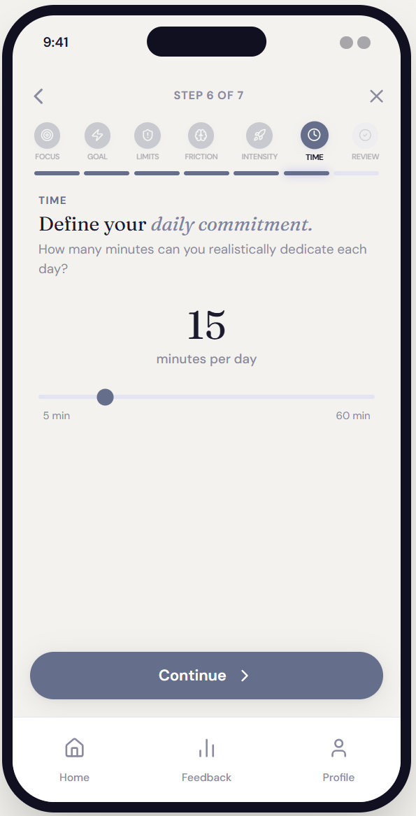
Onboarding | Time
-
![]()
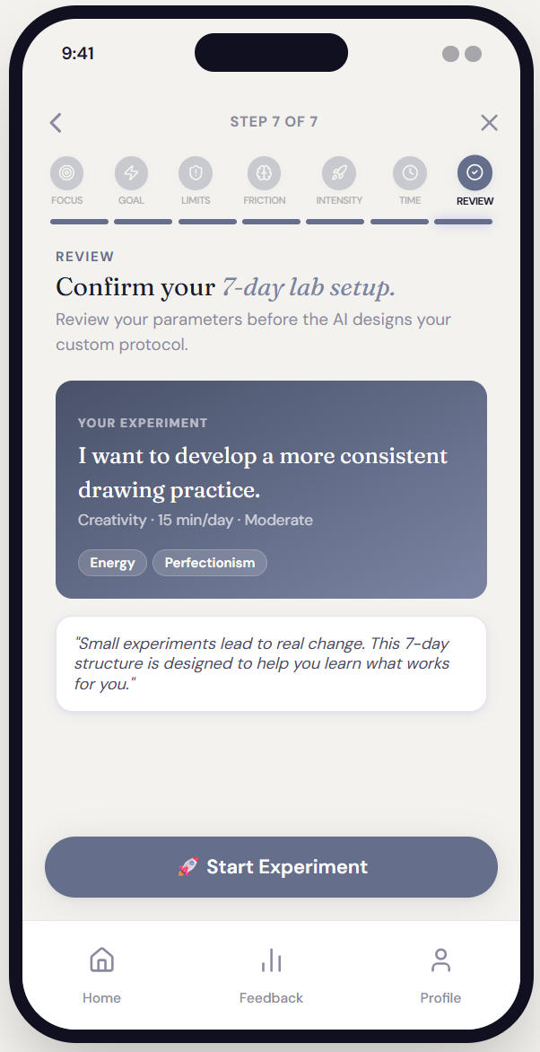
Onboarding | Review
The AI as behavioral scientist.
The AI system prompt is the product's core intellectual layer. It defines a role, a set of design principles, conditional logic rules, a strict output schema, and tonal constraints — all functioning together as a behavioral design engine.
This wasn't prompt engineering in the casual sense. It required understanding behavioral psychology well enough to operationalize it as a system: mapping emotional friction states to design responses, encoding safeguard logic, and specifying output format down to the structure of reflection prompts.
SYSTEM DESIGN
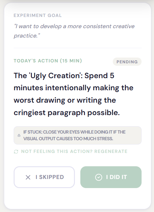
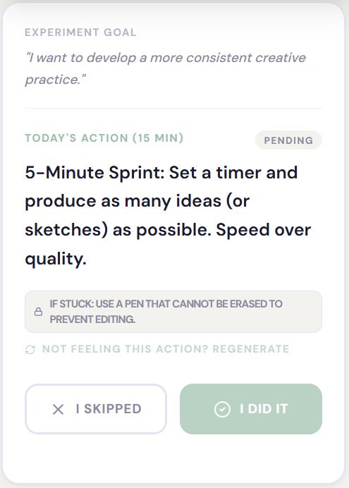
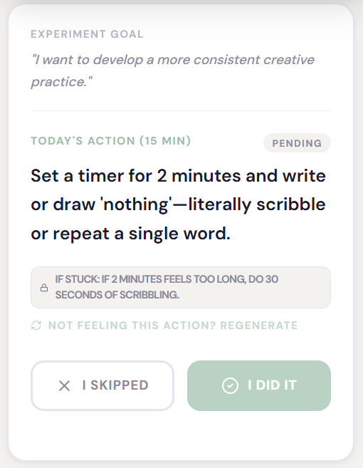
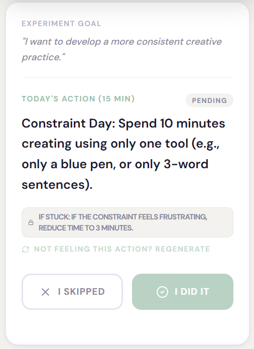
Day 1-4 prompts for the experiment goal of “I want to develop a more consistent creative practice.”
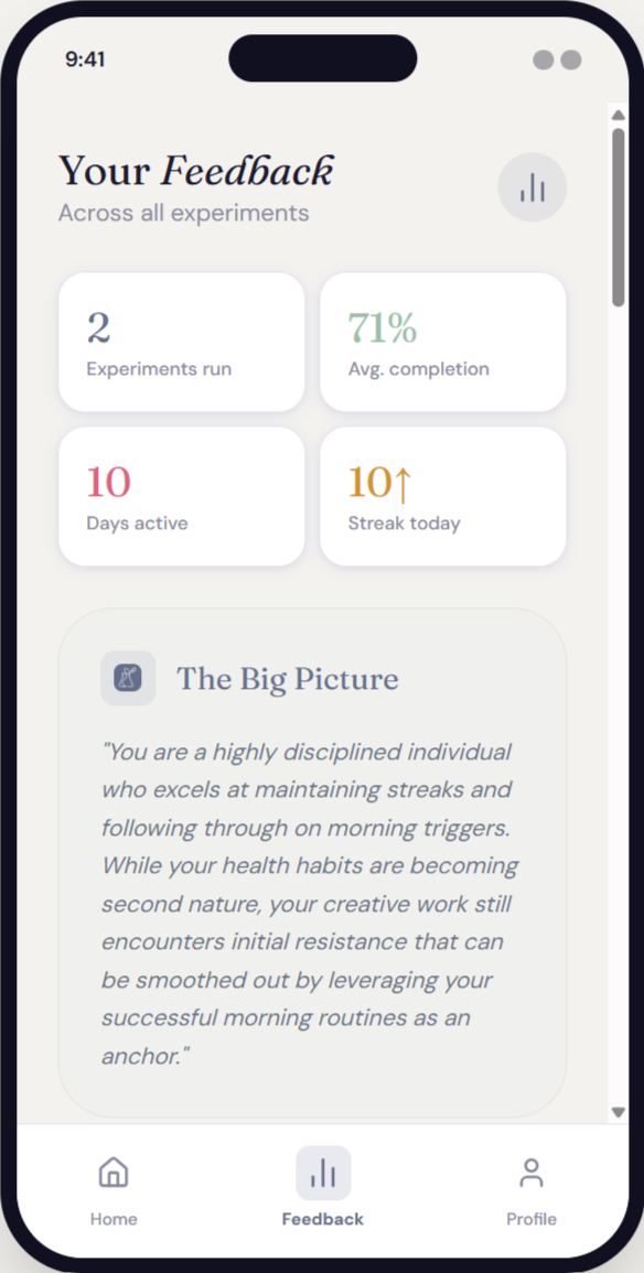
Individual entries reveal what happened. The insight engine reveals what it means. After 7 days, the AI reads across all mood ratings, difficulty scores, and free-form comments to surface behavioral signals that aren't visible entry by entry.
The analysis is structured around three specific outputs, each designed to produce a different kind of learning.
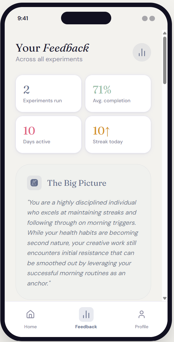
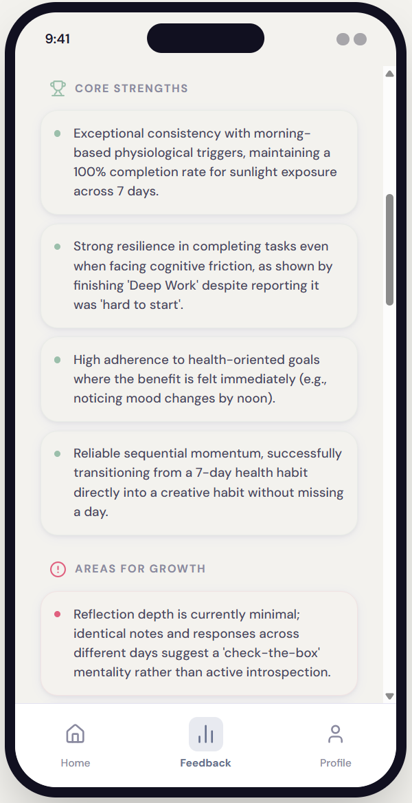
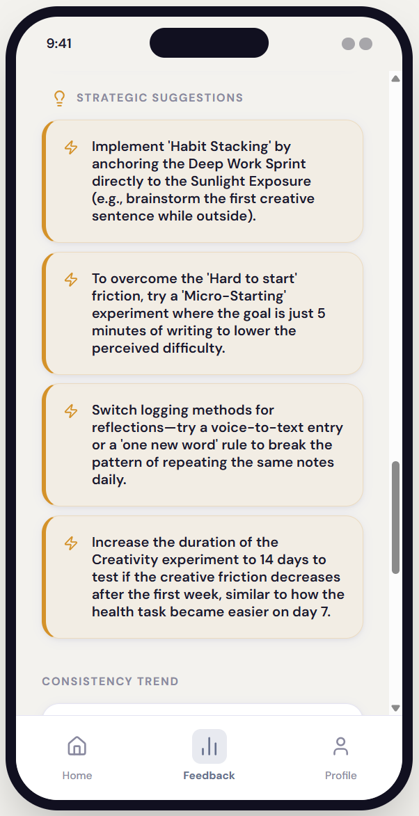
Insight engine feedback from a completed experiment gives a big-picture summary, core strengths, areas for growth, and strategic suggestions.
INSIGHTS ENGINE
The AI that reads between the days.
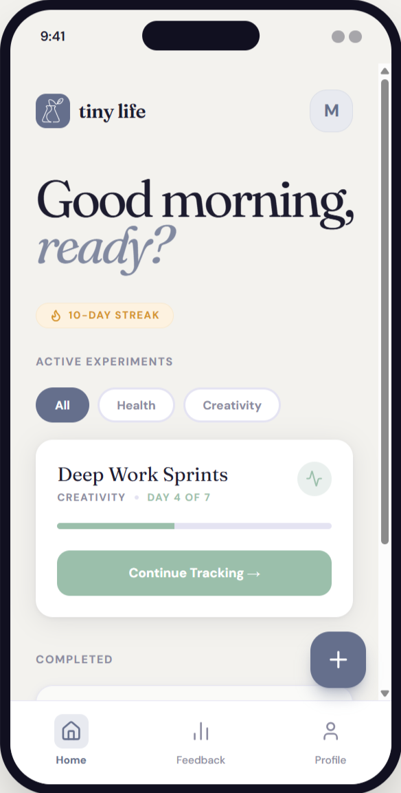
A thoughtful notebook, not a dashboard.
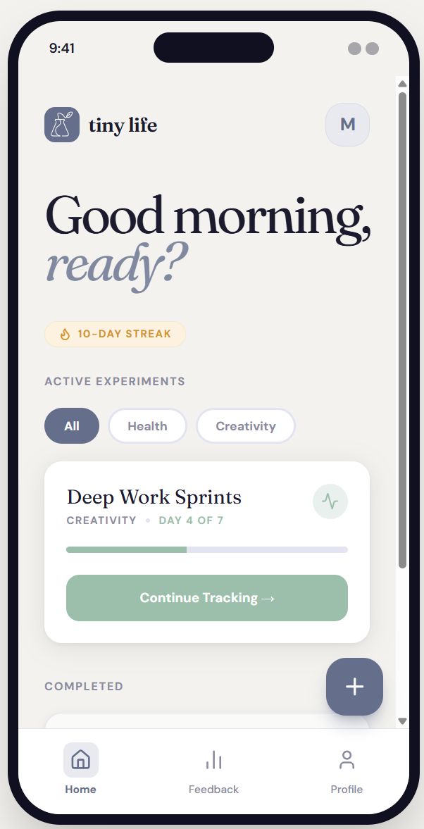
The visual language was designed to feel like a behavioral research notebook — calm, spacious, precise. Not gamified. Not clinical. The typography, color palette, and interaction patterns all reinforce the emotional register: this is a space for curiosity, not performance.
INTERFACE PHILOSOPHY
Single-Focus Screens
One primary action per screen. No competing priorities. Progress indicators show where users are in the experiment setup flow — without pressure.
Color System
Muted periwinkle as primary. Soft sage as accent. Off-white backgrounds. No harsh black on large surfaces. The palette signals calm attentiveness.
Card-Based Structure
Each experiment component lives in its own card. Generous spacing prevents cognitive overload and signals that each piece deserves attention.
What this project demonstrates.
AI system architecture: Designed a multi-layered system prompt that operationalizes behavioral science as conditional AI logic — not just writing instructions, but encoding a theory of change.
Domain translation: Translated behavioral psychology concepts (habit loops, exposure ladders, implementation intentions) into specific output constraints and adaptive rules.
Product-level thinking: Defined a distinct product philosophy — behavioral experimentation vs. habit tracking — and maintained that distinction across system design, UI, and tone guidance
Tonal precision: Authored detailed tone rules that governed both the AI coach voice and the interface feel — excluding specific failure modes like "productivity hype," "therapy voice," and "guru language.
Safeguard design: Embedded psychological safety mechanisms directly into the output schema — not as optional add-ons, but as required structural elements of every generated experiment.
OUTCOMES & REFLECTION