
Back to all work
PRODUCT DESIGN • UX STRATEGY
Total Experience Platform
Spearheading the design and implementation of a unified employee and customer experience platform at the State Department — bringing together dozens of platforms, tools, and services into a single personalized portal for over 1,500 employees worldwide
ROLE
Team Lead, Product Designer
A disjointed employee and customer experience was leading confusing and poorly-designed user experiences.
Employees at the Bureau of Overseas Buildings Operations were navigating a fragmented landscape of dozens of platforms and tools — Azure DevOps for project tracking, SharePoint for documents, GEMS and myData for HR information, the Foreign Service Institute for training, Enterprise IT Services for support requests, and many more. There was no single place where an employee could see their work, their requests, their training, and their resources in one view.
The result was wasted time, duplicated effort, and a disjointed experience that made even simple tasks — like checking the status of an IT request or finding a frequently used document — require navigating multiple systems with different interfaces and login flows. The Bureau needed a Total Experience platform that could unify these touchpoints into a single, personalized, coherent experience.
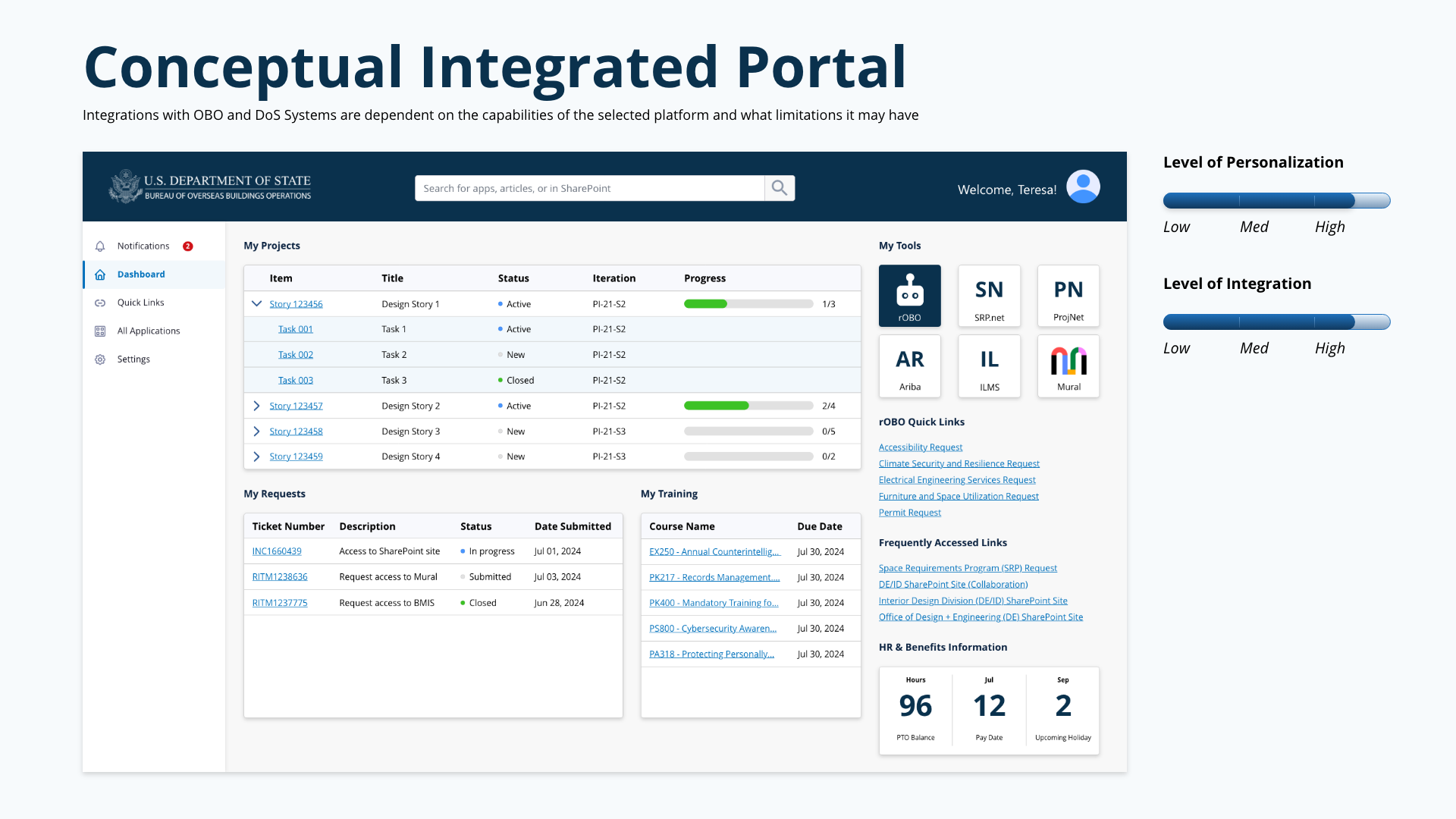
Total Experience Platform wireframe
CHALLENGE
Lean/Agile and Human-Centered
Following lean/agile and human-centered design methodologies, the team laid out the approach for tackling the challenge of unifying the experience across dozens of platforms and tools. Given the tight timeframe for implementation, we worked with stakeholders and leadership to prioritize the essential functionality for an MVP product, with the intention of scaling as we learned more from users.
APPROACH
01
Stakeholder Interviews
Conducted interviews across leadership, program managers, and field staff to understand pain points and daily workflows.
02
User Insights
Gathered behavioral data and user feedback to identify the highest-friction touchpoints across existing tools.
03
Analyze & Prioritize
Mapped the full ecosystem of platforms and data sources, then prioritized features by impact and implementation feasibility.
04
Design & Iterate
Developed wireframes, prototyped the portal experience, and iterated with stakeholders toward an MVP launch.
Tracing Every Decision to Productivity
After extensive market and user research, the team laid out the proposed features and business requirements. Because of the complexity of the requirements and use cases, we developed a hierarchy so that every decision point could be traced back up to the ultimate goal of increasing employee productivity.
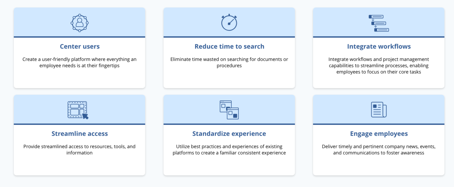
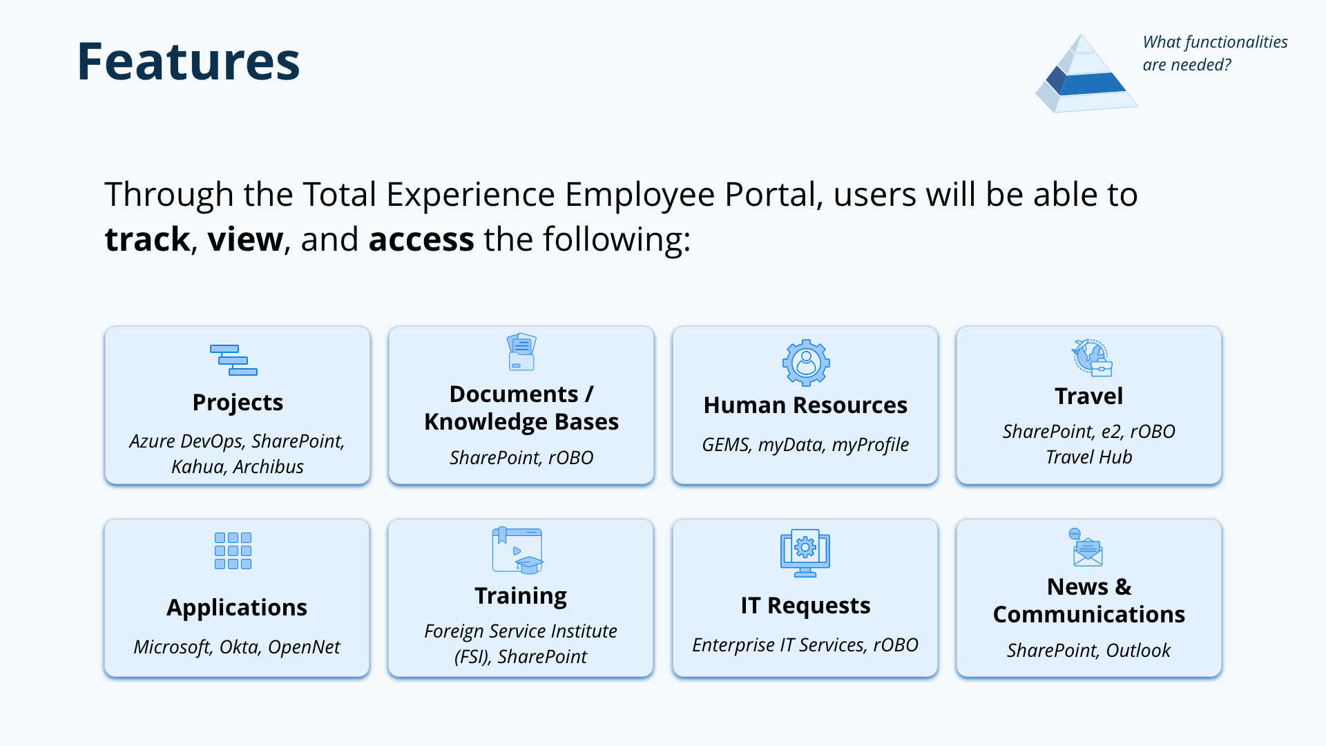
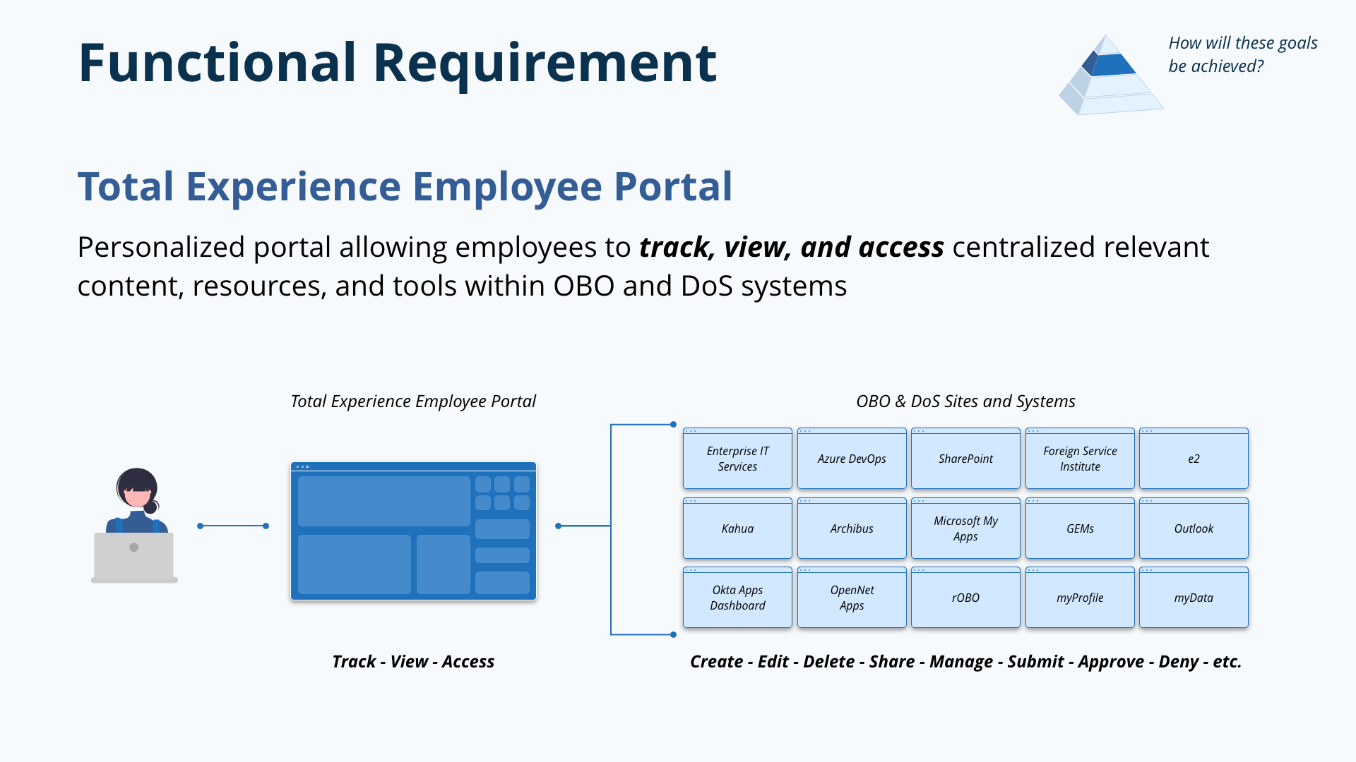
The business requirement was clear: provide easy access to resources, tools, and information; eliminate time wasted on searching for documents and applications; create a user-friendly platform where everything an employee needs is at their fingertips. The functional requirement translated this into a personalized employee self-service portal allowing employees to access, view, and manage applications, resources, and tools from a single interface.
BUSINESS REQUIREMENTS
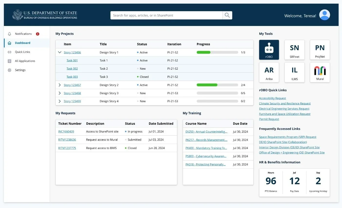
One Place for Everything
Through the Total Experience Employee Portal, users can centrally track, view, and access everything they need. The portal integrates data from across the Bureau's ecosystem — pulling project data from Azure DevOps, documents from SharePoint, training records from the Foreign Service Institute, HR information from GEMS and myProfile, and IT service requests from Enterprise IT Services.
PORTAL FEATURES
The Portal Experience
The portal landing page was designed as a personalized dashboard. On login, employees see their active projects with status and progress, their open IT and service requests, upcoming and completed training courses, team tools with quick access to colleagues' profiles, frequently accessed links, and HR/benefits information at a glance — including PTO balances, pay dates, and upcoming holidays.
Every module on the dashboard pulls live data from its source system. The design had to balance information density — employees wanted everything at a glance — with clarity, ensuring the interface didn't become overwhelming despite aggregating data from six or more source systems.
DESIGN
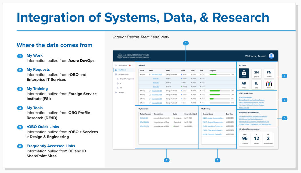
Where the Data Comes From
A critical part of making the portal feel unified was making the data integrations invisible to the user. Behind each module on the landing page, data is pulled from a different source system — My Work from Azure DevOps, My Requests from rOBO and Enterprise IT Services, My Training from the Foreign Service Institute, My Tools from OBO Profile Research, and Quick Links from rOBO's services directory.
Users don't need to know or care where the data lives. They just see their information, organized around their needs rather than around the Bureau's org chart or technology stack.
INTEGRATION ARCHITECTURE
Analysis of Alternatives
The team conducted an extensive and thorough analysis of alternatives to recommend a platform that met the criteria uncovered during the research phase. We evaluated platforms across dimensions including customization, extensibility, security compliance, data integration capabilities, mobile responsiveness, and cost — scoring each against the must-have and nice-to-have requirements that had emerged from our stakeholder and user research.
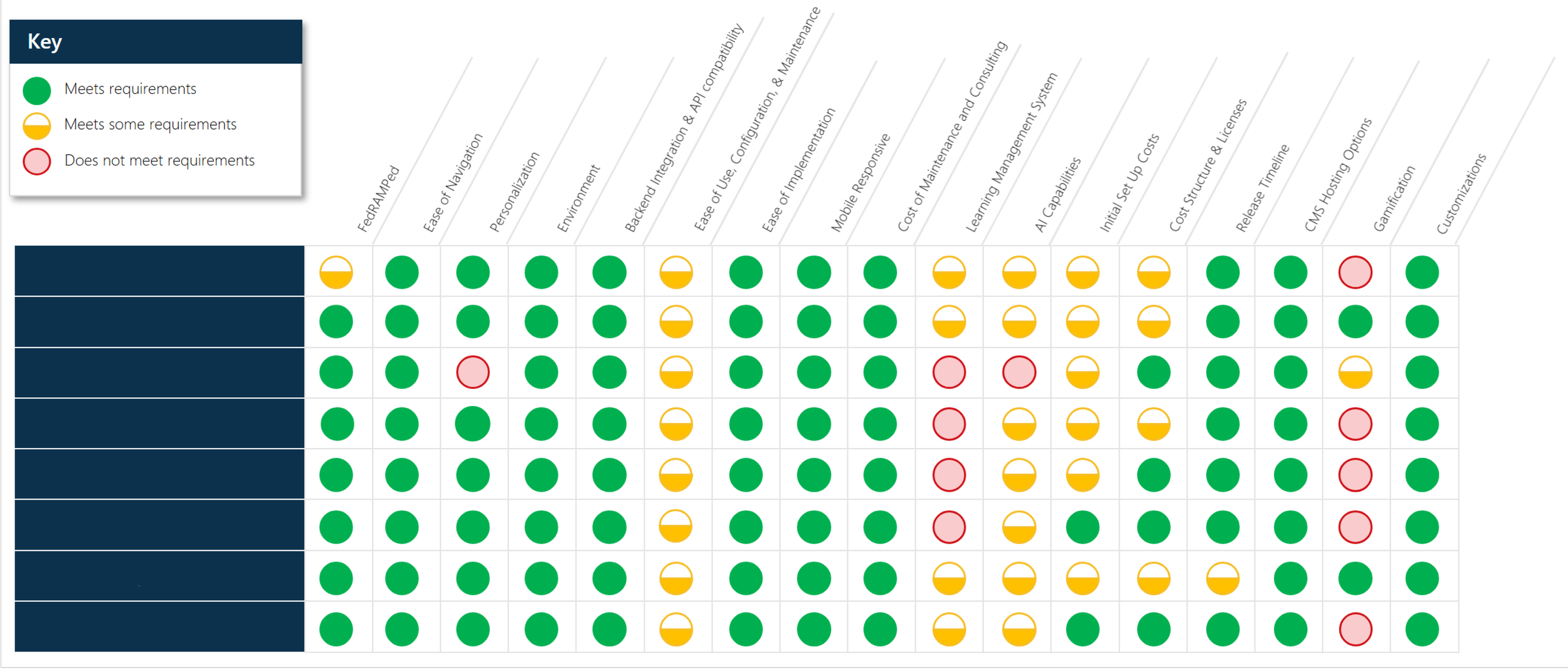
Criteria matrix to analyze potential platforms.
PLATFORM SELECTION

Back to all work